I started redesigning the house in the last couple weeks. After visiting the Guardian Building (click here for that post) which was built between 1928/1929, I was hugely influenced by the feel of that building, and decided I want to bring some of that Roaring 20s glamour back to my own 1920s house.
One of the most major things that struck me about the Guardian Building was the color used. The turquoise and coral was so striking against the neutral tans and metal.
Colors like this were a hallmark of the Art Deco movement. As you can see here:
I was really drawn to the combo of the deep eggplant purple, with the coral and turquoise. It's Art Deco, but it's also really reminiscent of "Pre-Colombian" art from Latin & South America.
When the turquoise is introduced to the rest of the colors, they hang back and just act to draw out the brilliance in that light blue.
**Another obsession of mine happens to be Pantone color chips. I don't know why I can geek-out over color number, names and combinations for the rest of my life and be entirely happy.**
So my walls were already this rich Caramel Latte color:
which because Pantone is awesome, you can get a cute tea/coffee mug to MATCH PERFECTLY!! SWOOOOOOOOOOOOOOOOOOON.
I found this "Human Sacrifice Coral", or as Pantone so delightfully calls it - Tangerine Tango:
And then this SUPER RICH GORGIE purple color, which I've been painting my previously black picture frames with, and they are just reading a neutral dark. Which i think is so mindblowingly enchanting.
You bet your bottom dollar that for Christmas this year I'm going to get ALL OF THESE ORNAMENTS. omg.
And then this Turquoise as well.
Which since it was "Color of the Year" in 2010, you can just SWAG YOUR BRAINS OUT WITH.
And then what happens when you put all these colors together is almost musical. The Turquoise leads, the Coral gives warmth, and the purple accents... on the canvas that is the 729 C.


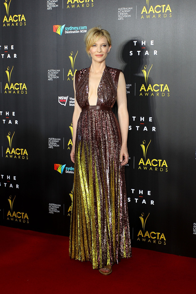 Cate Blanchett in a marvelous shimmery Givenchy gown. I've said for years this woman wears art!

 Rivera's tee is a salute to her brother Mychal, 23 who plays for the Oakland Raiders.
 Go Team UjENA!


 Paris Hilton has been M-I-A for years. I almost forgot about her. However, I have to give respect when its do! Prior to the media storm of
 For this reason alone red has always been one of my favorite colors. I think that could be the Scorpio in me but


